Lecture 2
Point and Interval Estimates
Sampling Distribution
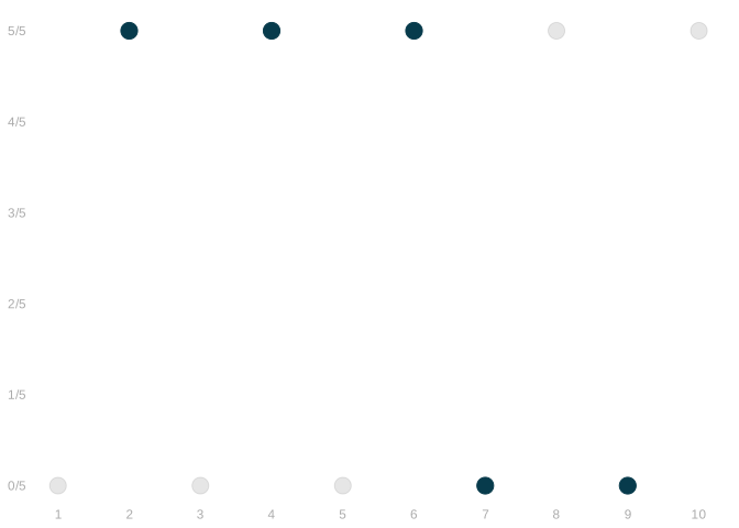
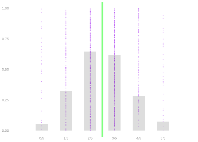
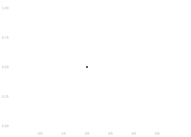
- Each ● is one repetition of the same sampling scheme.
- Convenience sampling gets a single point because repeating it changes nothing — we survey the same people every time.
Fake Data Simulation
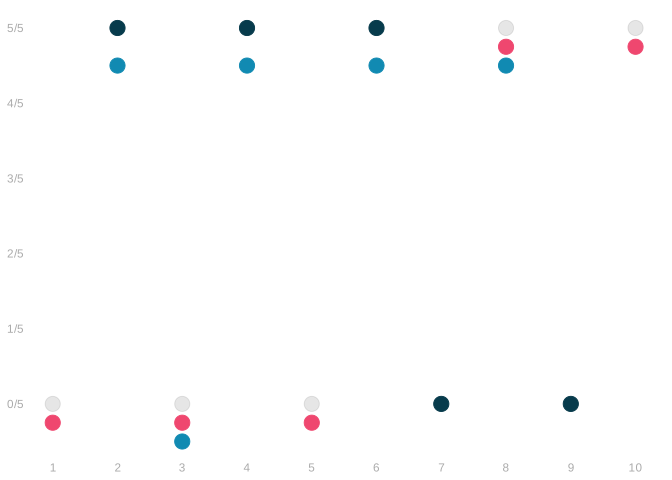
\[ \color{gray} \begin{array}{r|rrrrrrrrrr|r} j & 1 & 2 & 3 & 4 & 5 & 6 & 7 & 8 & 9 & 10 & \bar{Y} \\ y_{j} & 0 & \textcolor[RGB]{7,59,76}{1} & 0 & \textcolor[RGB]{7,59,76}{1} & 0 & \textcolor[RGB]{7,59,76}{1} & \textcolor[RGB]{7,59,76}{0} & 1 & \textcolor[RGB]{7,59,76}{0} & 1 & \textcolor[RGB]{7,59,76}{3/5} \\ y_{j} & \textcolor[RGB]{239,71,111}{0} & 1 & \textcolor[RGB]{239,71,111}{0} & 1 & \textcolor[RGB]{239,71,111}{0} & 1 & 0 & \textcolor[RGB]{239,71,111}{1} & 0 & \textcolor[RGB]{239,71,111}{1} & \textcolor[RGB]{239,71,111}{2/5} \\ y_{j} & 0 & \textcolor[RGB]{17,138,178}{1} & \textcolor[RGB]{17,138,178}{0} & \textcolor[RGB]{17,138,178}{1} & 0 & \textcolor[RGB]{17,138,178}{1} & 0 & \textcolor[RGB]{17,138,178}{1} & 0 & 1 & \textcolor[RGB]{17,138,178}{4/5} \\ \end{array} \]
- This was a huge time-saver. But is our estimate trustworthy?
- How close was our estimate to the actual proportion in the population of 10?
- We looked into it ahead of time by running a simulation of our survey on a fake population.
- We did exactly what we did in our actual survey, but we did it over and over.
- This let us look at what our estimator does, knowing what we want it to do: be \(\textcolor{gray}{ \approx 5/10}\).
- Above, we’ve shown the results of three of these simulations.
- We call the distribution of estimates we get like this our estimator’s sampling distribution.
- These three estimates are three draws from the sampling distribution.
- That’s three equally-likely outcomes of our survey. And we do ok in these three.
- But that’s just three. To get a better sense of what’s likely, we should look at a lot more.
Visualizing the Sampling Distribution
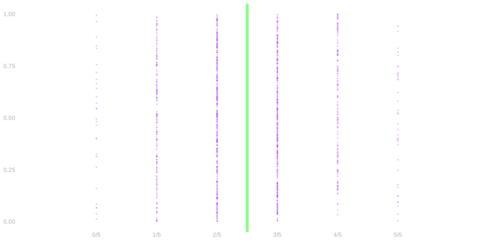
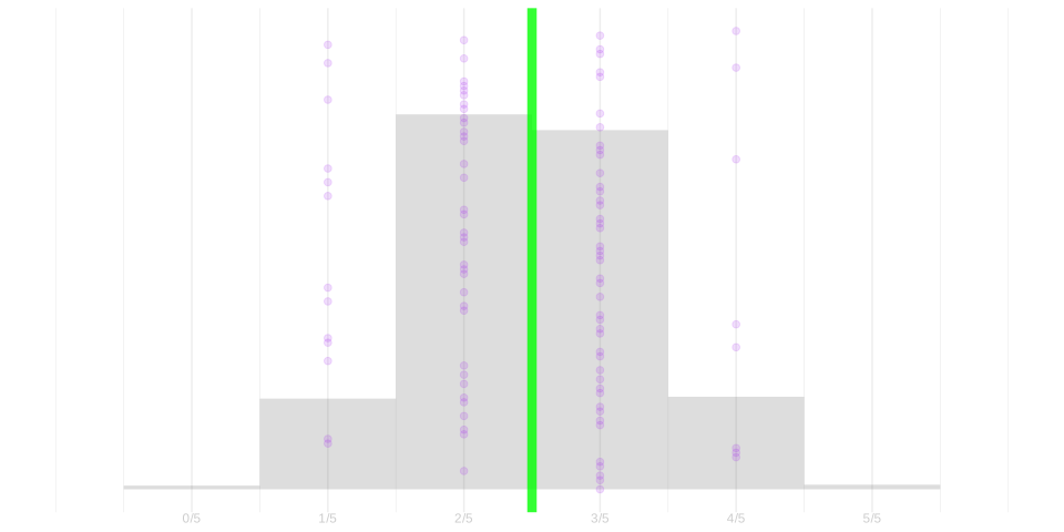
- Above, we plot 1000 draws from the sampling distribution as 1000 ●s.
- To highlight what we want, we’ve drawn the population proportion as a green line.
- Eyeballing it, we can see that estimates are usually pretty close, but not always.
- To be more precise, we could count the dots in each column. But it’s easier to ask our computer to do it for us.
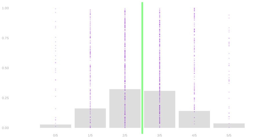
- We can draw in the proportion of dots in each column as a bar graph.
- If you really want to count dots in columns, this is the way to do it.
- But they can be a bit counterintuitive visually because of the uneven spacing of the columns.
- Most of the dots are in the middle, but there are a lot of columns there. A lot of slightly different estimates.
- As a result, no bar there is particularly high. The highest bar is out at \(x=1\).
- How do we visualize the distribution of dots without this problem?
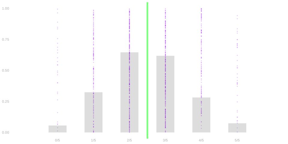
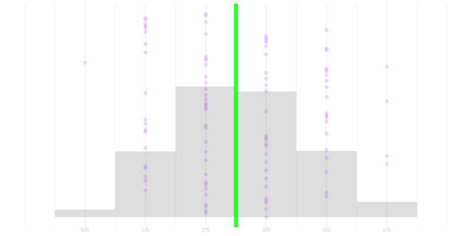
- We can group together nearby columns into equal-width bins and count the dots in each bin.
- This gives you a sense of the density of estimates near each value of \(x\).
- We call this kind of plot a histogram.
- If you want to know the fraction of dots in some interval, this makes it easy.
- As long as it’s the interval between two bin edges.
- It’s the fraction of the histogram’s area that’s between them.
Sampling Distributions in Real Studies
It’s easy to think about sampling distributions when we’re running a simulation of our study.
- We can run our simulation as many times as we want and plot the sampling distribution.
- And we can use our knowledge of the population to see if we’re happy with it.
In a real study, we don’t have any of this. All we get is one estimate.
But that doesn’t stop us from filling in the rest of the picture by …
- thinking of it as one draw from our estimator’s sampling distribution.
- working out where that sampling distribution is in relation to the estimation target.
- using the data we have to estimate the sampling distribution.
What Do We Do with a Sampling Distribution?
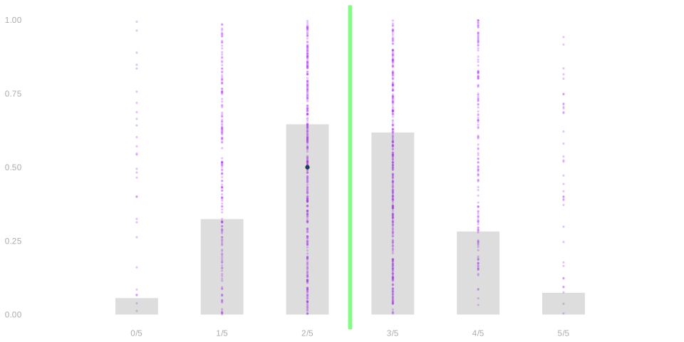
- A sampling distribution is an odd summary of the proportion of people who prefer chocolate.
- It’s not what you asked for. You asked for a single number describing a population.
- What you got was 1000 numbers describing 1000 samples.
- But it does tell you something if you look at it right.
- How often is the estimate exactly equal to the population proportion? 0% of the time.
- How often is it off by \(\textcolor[RGB]{17,138,178}{1/5}\) or less? 63% of the time.
- To make this sound like a statement about the population, we report two things.
- An interval you can expect the population proportion to be in.
- e.g., we think it’s in the interval \(\textcolor[RGB]{7,59,76}{3/5} \pm \textcolor[RGB]{17,138,178}{1/5}\) because \(\textcolor[RGB]{7,59,76}{3/5}\) is our sample proportion.
- The degree of confidence you have that it’s actually in it.
- e.g., it’s in an interval calculated exactly like this in 63% of surveys run exactly like this.
Review: Connecting Sample and Population
- For each call \(i\), we randomly select a voter with an id we’ll call \(J_i\).
- And we record as that call’s outcome the turnout of that voter: \(Y_i=y_{J_i}\).
- On each call, each registered voter has a \(1/7.23M\) chance of being called.
- This is called sampling with replacement because we could call the same person twice.
- In our poll, this is unlikely because we’re making a small number of calls relative to population size.
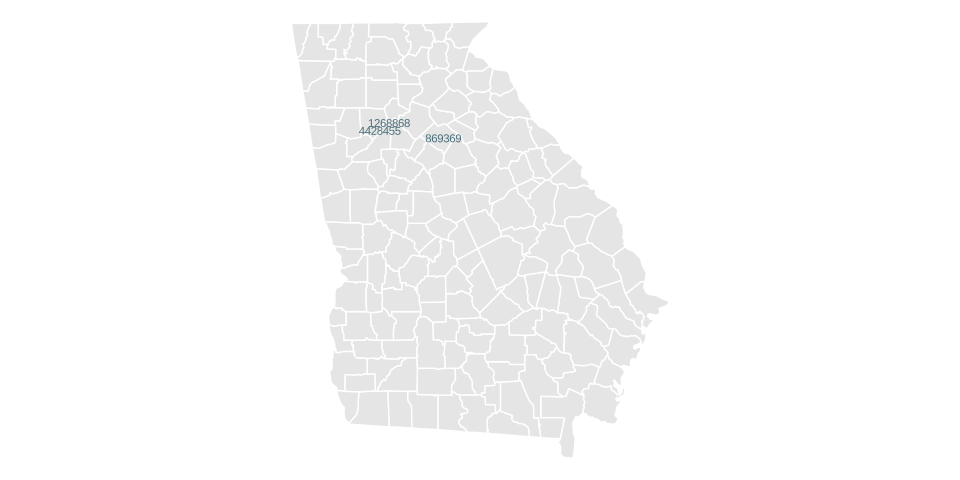
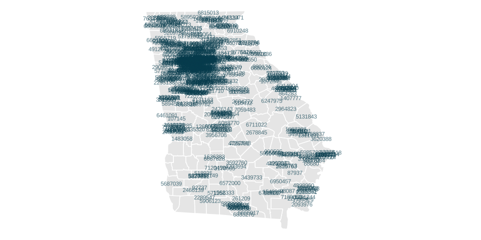
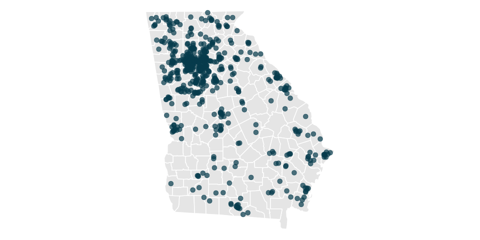
\[ \begin{array}{r|rr|rr|r|rr|r} \text{call} & 1 & & 2 & & \dots & 625 & & \\ \text{variable} & J_1 & Y_1 & J_2 & Y_2 & \dots & J_{625} & Y_{625} & \overline{Y}_{625} \\ \text{value} & 869369 & \underset{\textcolor{gray}{y_{869369}}}{1} & 4428455 & \underset{\textcolor{gray}{y_{4428455}}}{1} & \dots & 1268868 & \underset{\textcolor{gray}{y_{1268868}}}{1} & 0.68 \\ \end{array} \]
Our Poll
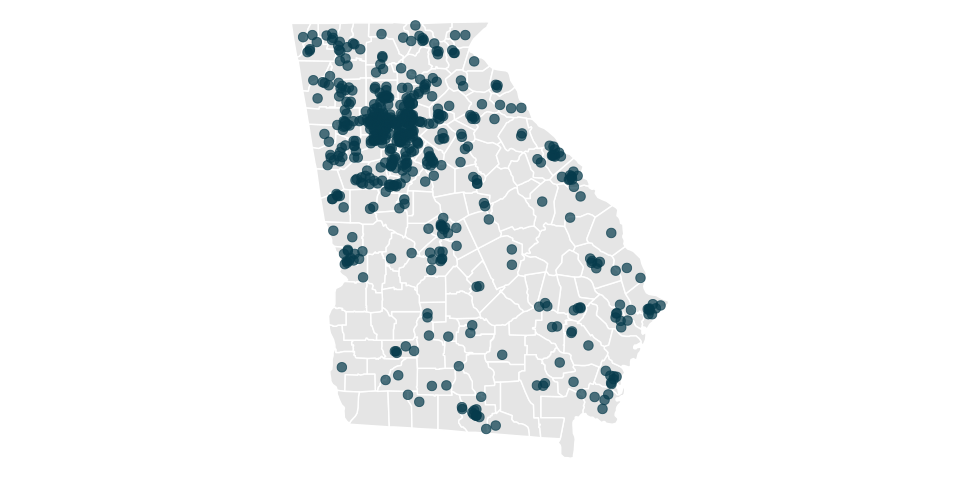
\[ \begin{array}{r|rr|rr|r|rr|r} \text{call} & 1 & & 2 & & \dots & 625 & & \\ \text{variable} & J_1 & Y_1 & J_2 & Y_2 & \dots & J_{625} & Y_{625} & \overline{Y}_{625} \\ \text{value} & 869369 & \underset{\textcolor{gray}{y_{869369}}}{1} & 4428455 & \underset{\textcolor{gray}{y_{4428455}}}{1} & \dots & 1268868 & \underset{\textcolor{gray}{y_{1268868}}}{1} & 0.68 \\ \end{array} \]
Our First Friend’s Poll
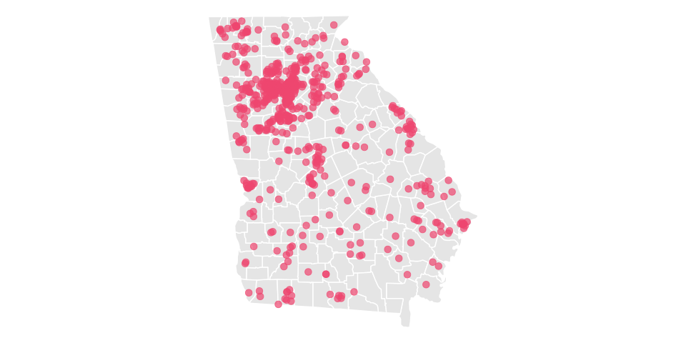
\[ \begin{array}{r|rr|rr|r|rr|r} \text{call} & 1 & & 2 & & \dots & 625 & & \\ \text{variable} & J_1 & Y_1 & J_2 & Y_2 & \dots & J_{625} & Y_{625} & \overline{Y}_{625} \\ \text{value} & 600481 & \underset{\textcolor{gray}{y_{600481}}}{0} & 6793745 & \underset{\textcolor{gray}{y_{6793745}}}{1} & \dots & 1377933 & \underset{\textcolor{gray}{y_{1377933}}}{1} & 0.71 \\ \end{array} \]
Our Second Friend’s Poll
\[ \begin{array}{r|rr|rr|r|rr|r} \text{call} & 1 & & 2 & & \dots & 625 & & \\ \text{variable} & J_1 & Y_1 & J_2 & Y_2 & \dots & J_{625} & Y_{625} & \overline{Y}_{625} \\ \text{value} & 3830847 & \underset{\textcolor{gray}{y_{3830847}}}{1} & 5887416 & \underset{\textcolor{gray}{y_{5887416}}}{1} & \dots & 4706637 & \underset{\textcolor{gray}{y_{4706637}}}{1} & 0.70 \\ \end{array} \]
The Sampling Distribution in R
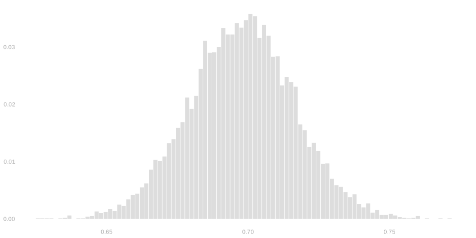
We run 10,000 simulated polls and store who we call (J) and what they say (Y).
We calculate the sample proportion for each poll.
And we histogram the result.
Before we look at the real thing, let’s sketch the histogram we expect to see.
Checklist
- Is the histogram you drew in the location you think it should be?
- What about the shape? Is its spread what you think it should be?
Annotating the Sampling Distribution Histogram
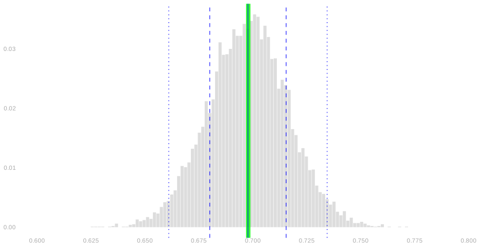
- There are a few features we may want to highlight.
- The mean of the sampling distribution is the solid blue line.
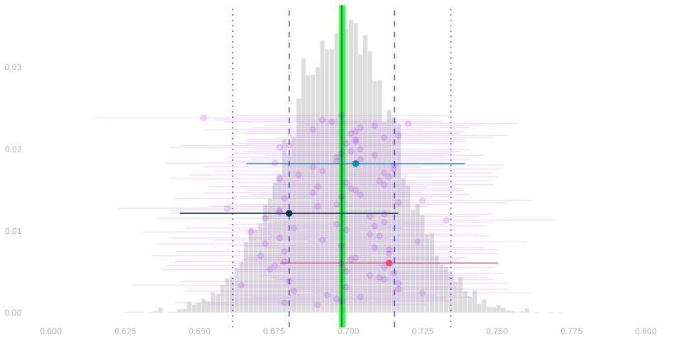
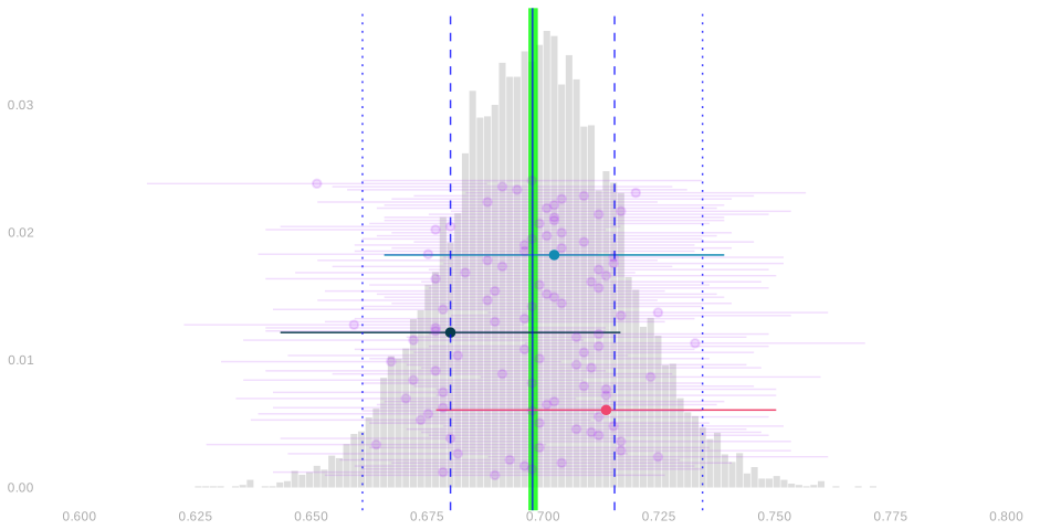
- The middle 2/3 of the sampling distribution lies between the dashed blue lines.
- The middle 95% of the sampling distribution lies between the dotted blue lines.
- Our estimation target — the turnout frequency in the population — is drawn as a wide green line.
- It’s in exactly the same place as the solid blue line.1
- What does this tell us about our estimator?
Revisiting our Questions
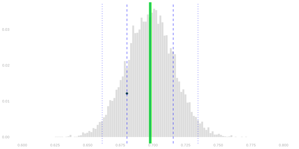
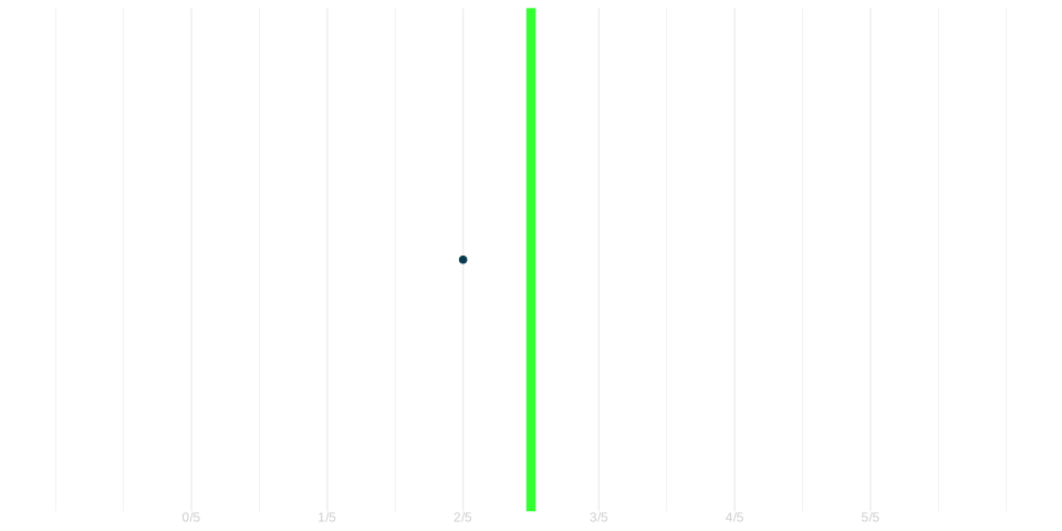
Observation. Our estimate — the black dot — is close to our estimation target. It’s within 2%.
Q. Did we get lucky?
Not really.
- In 68% of polls, the estimator is within 2% of the target.
- In 95% of polls, the estimator is within 4% of the target.
Q. Could we have predicted how close we’d get before the election happened?
Yes, in sense.
- We will use an interval estimate—a range of values the estimation target is likely to be in.
- The width of this interval speaks to the ‘how close’ question.
- The coverage probability — the probability our estimate is actually that close — qualifies this answer.
Interval Estimation
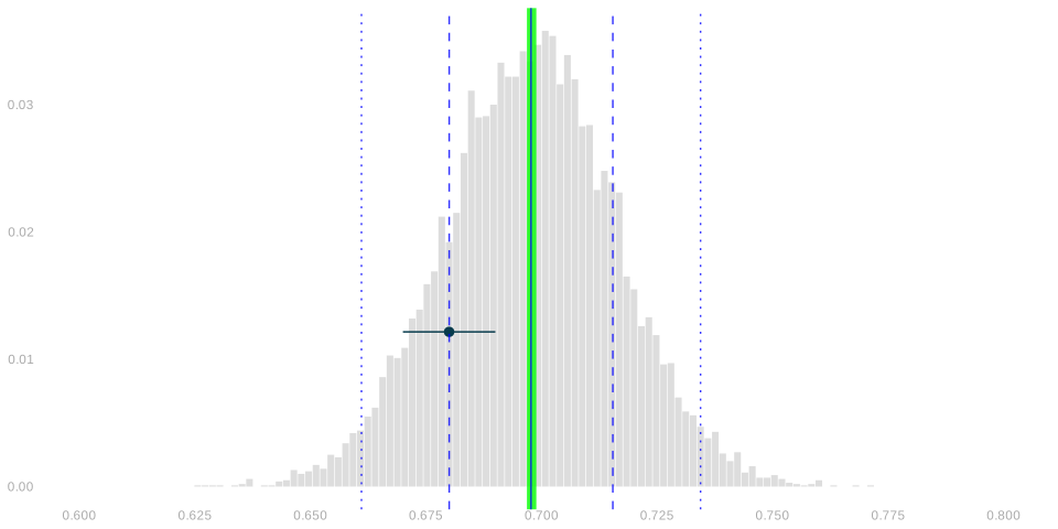
- Our point estimate of the turnout frequency in our population is the turnout frequency in our sample: \(\overline{Y}_{625}\).
- So let’s try an interval of width 0.02 centered on it: \(\ \ \overline{Y}_{625} \pm 0.01\).
- This is just a width we chose arbitarily.
- Maybe it’s wishful thinking. Being off by at most 1% sounds good.
- What we want is for our interval to cover our estimation target.
- i.e. for the population frequency to be in our interval.
- This one doesn’t. Is that just bad luck? Or is it typical of \(\pm 0.01\) intervals?
- Let’s see what happens when our friends try intervals like this.
Interval Estimation: Our Friends’ Polls
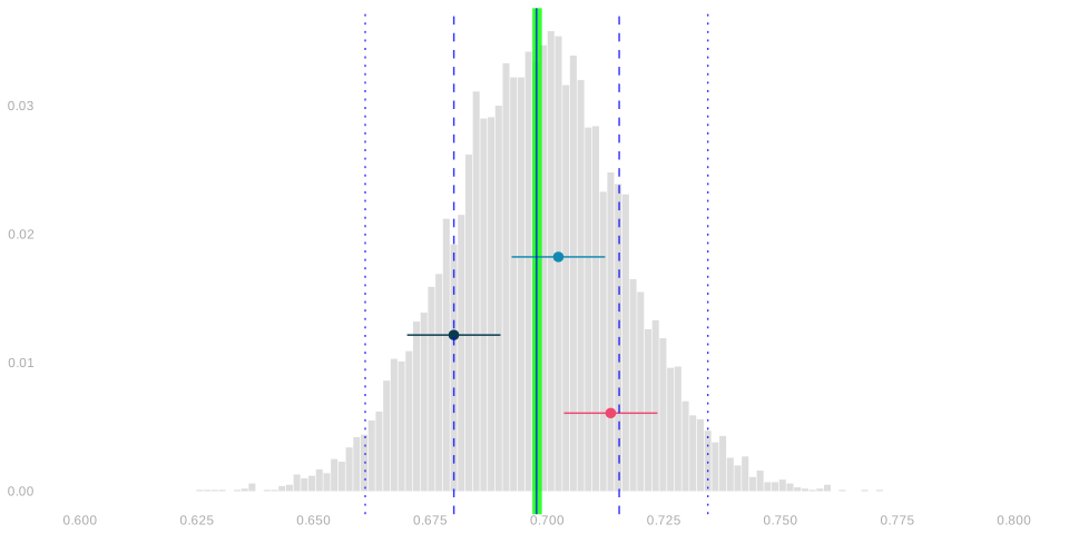
- Here are the interval estimates our first two friends.
- That is, the interval estimates based on the pink and teal rows in our sampling distribution table.
- One of these intervals covers the estimation target. The teal one.
- So between ours and our two friends, we’re covering 1/3 of the time. Not great.
- But that’s just three polls. To get a better sense of how often this happens, let’s do it for a hundred.
Interval Estimation: 100 Polls
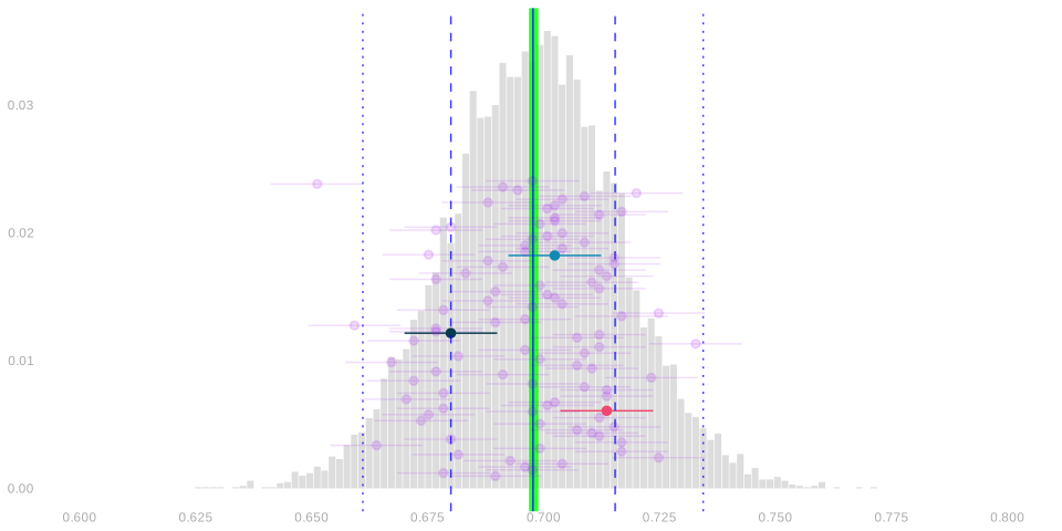
- \(45/100\) cover the estimation target.
- This gives us a sense of the probability that our interval covers the target.
- If we want to be more precise, we could do the same for millions of different polls.
- Let’s not. Instead, let’s find a more direct way to calculate the coverage probability.
Coverage Probability and Sampling Distributions
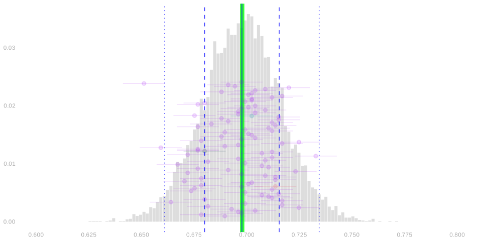
Activity. Explain how to calculate this coverage probability using the sampling distribution of your point estimate \(\bar Y_{625}\).
- Suppose you want to use a diagram like this to count how many of our 100 intervals cover the estimation target.
- But you don’t want to look at the horizontal segments for each poll. They’re small and hard too see.
- You just want to use the dots representing each poll’s point estimate \(\bar Y_{625}\).
- Sketch something on top of our diagram to help you count.
- An interval estimate is a point — a ‘body’ — with ‘arms’ of a certain length. Not so different from you.
- Suppose you had identical twin. And you’re not sure whether you’re standing close enough to touch them.
- But you don’t want to put your arms out. You’re tired from all that polling. Could your twin check for you?
- Now you’ve worked out how to count how many of 100 intervals cover the estimation target.
- What would you do if you had a million? Or a billion? That’d be good enough.
- If x% of a billion intervals cover, you’re pretty safe saying that x% is the coverage probability.
- You can’t look at a billion dots one by one, but you can look a histogram of a billion dots.
- Explain how to use that histogram to calculate the coverage probability. Use your sketch from Step 1.
Calculating Coverage
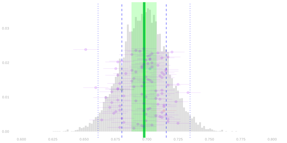
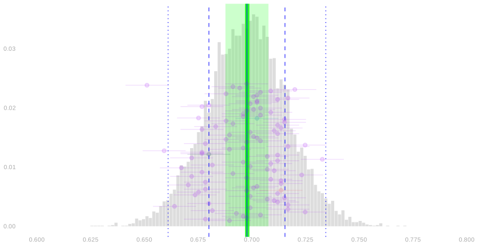
- Let’s shade in an interval of width .02 centered on the estimation target.
- This gives it ‘arms’ the same length as our interval estimates have.
- And its arms touch a point estimate if and only if the point estimates’ arms touch it.
- That means we can count the intervals that cover by counting the point estimates between the dotted lines.
- What, in terms of the sampling distribution of the point estimate, is the coverage probability?
The Coverage Probability
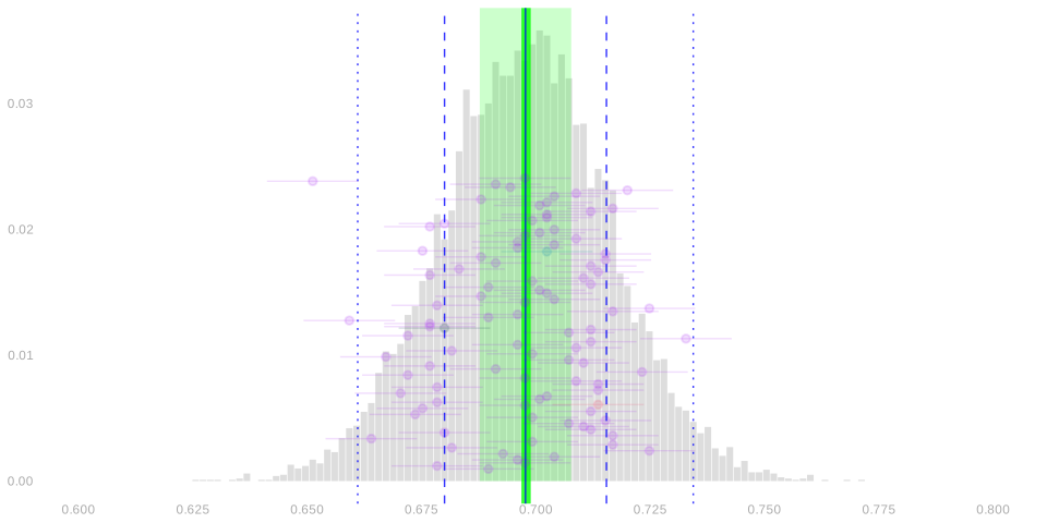
It’s the probability that a random draw from the sampling distribution lies in the green shaded area. \[ \text{coverage probability} = P\qty(\overline{Y}_{625} \in \overline{y}_{7.23M} \pm .01) \]
And it’s about 43%. We can get that by counting dots.
Or by finding the area of the histogram that’s shaded green.
Ad-hoc Interval Estimates
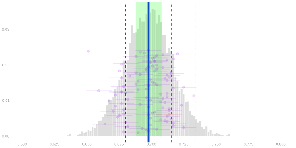
What we just did was choose a width and calculate a coverage probability.
- The coverage probability we found — 43% — probably wasn’t what we wanted.
- Think of how you’d advertise your polling services.
- ‘I’m right about half the time. Actually, a bit less than that’.
- 95% sounds a lot better. For that, we’ll have to use a wider interval.
Calibrated Interval Estimates
- Instead of choosing a width and calculating the coverage probability, let’s go backward.
- We’ll choose a coverage probability — 95% is conventional.
- And we’ll calculate the width we need to get it.
- An interval estimate calibrated like this—to have a given coverage—is called a confidence interval.
- Let’s think about how to do that. Again, we’ll use the sampling distribution of our point estimate.
- Let’s take a look at our annotated histogram of point estimates again.
Using the Sampling Distribution for Calibration
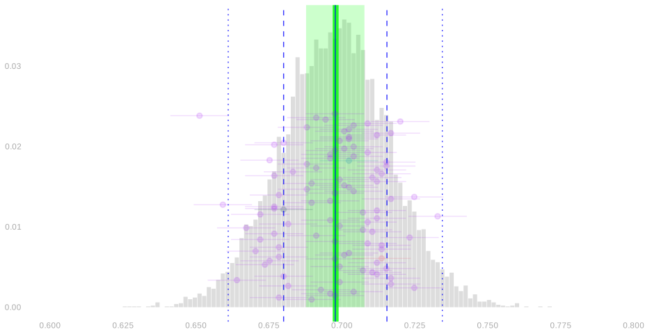
Question.
- Suppose you and your friends want to draw 95% confidence intervals around your point estimates.
- How wide do you have to make them to actually get 95% coverage?
Review—Our Annotations
- The mean of the sampling distribution is the solid blue line—and is the same as the estimation target.
- The middle 2/3 of the sampling distribution lies between the dashed blue lines.
- The middle 95% of the sampling distribution lies between the dotted blue lines.
Using the Sampling Distribution for Calibration
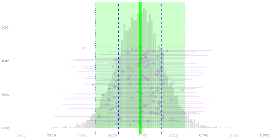
Answer.
- The width of a 95% interval should be the width between the dotted blue lines.
- That’s the width of the ‘arms’ containing 95% of the estimates drawn from the sampling distribution.
- You can check that these intervals have the coverage we want.
A Problem
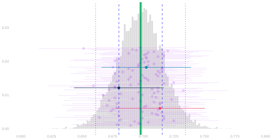
- We can’t calibrate intervals like this in real life.
- When we run our a poll, we get a single point estimate \(\bar Y_{625}\) based on our sample.
- We don’t know the sampling distribution of this point estimate until election day.
- But what we actually do is almost the same.
- We do the same thing.
- But we use an estimate of the sampling distribution in place of the thing itself.
- That’s what we’ll talk about next class.
Why Confidence Intervals?
Talking about calibrated interval estimates, a.k.a. confidence intervals, has some advantages.
- It focuses on what we actually want to know: where the estimation target is.
- It reminds us that we’re not (usually) going to be able to know it exactly.
- It gives us a sense of how close we can expect that we’ve gotten.
But there’s something about them that is a bit infuriating when you’re not used to them.
- Fundamentally, you’re talking about what would happen in surveys you aren’t doing.
- You can imagine someone saying ‘I don’t have time for imaginary surveys. What did this one tell you?’
- And being pretty unhappy when the answer is ‘If that’s how you want to think about it, almost nothing.’
This isn’t a problem with intervals. This is something that’s fundamentally uncomfortable about sampling.
- It might feel like a miracle that you can say anything about 7.23M people after 625 phone calls.
- But once someone thinks you can, it can be hard for them to accept that you also kind of can’t.
- We really are just saying ‘I think it’s between 64% and 72%, but I’m wrong sometimes.’
- We are being clear about what ‘sometimes’ means.
- But that feels like it’s about you more than it is about what they want to know.
Don’t Make this Mistake
- Talking about surveys you aren’t doing is pretty awkward. So awkward that you’ll want to try to avoid it.
- It’s tempting to say something nonsensical.
- e.g. “the turnout frequency in the election is in my confidence interval, 0.64-0.72, 95% of the time.”
- This a really weird thing to say. It’s like saying that 95% of the time 2 is between 1 and 3. It either is or it isn’t.
- The only way it could make sense is if the turnout frequency were random. Because 0.64 and 0.72 aren’t.
- People do that. Don’t. And please don’t encourage it by saying stuff like this.
- This doesn’t come up that often because you can just say ‘confidence interval’ most of the time.
- So you really only have to deal with all of this awkwardness in two situations.
- When you say ‘confidence interval’ and someone asks what that means.
- When someone else says ‘confidence interval’ but clearly doesn’t know what it means.
- You’ll get to practice this a bit. Homework, quizzes, maybe exams.